Creating an excellent responsive menu for WordPress
Mobile navigation has become one of the hottest topics of discussion among WordPress designers and developers. Irrespective of how beautiful your site is, if it lacks seamless navigation, you’re bound to lose vital customers. If you’re running a WordPress powered website and are inclined on designing a fabulous responsive menu for the same, then you need not fret. This is a blog which will allow you to learn the technique of designing a remarkable responsive menu for your WordPress portal. So, let’s straightaway learn more about this process.Step 1- Generate a Child Theme
Child theme has been regarded as one of the best ways of customizing the original theme without losing any of the modifications. You can head on with creating a child theme for your WordPress site by simply copying across the header.php file from your currently installed theme and creating an empty functions.php file.Step 2- Add a new location for the new responsive menu
As the next step, you’ll be required to add a new location for the responsive menu. Any new menu added thereafter can be easily assigned to this location without the need for updating the stylesheet on a regular basis. Just add the following code snippet to your theme’s functions.php file for adding a new menu location:PHP
1234
function responsive_menu_setup() {/*== Register responsive menu ==*/
	register_nav_menu ('Responsive Menu', __( 'Responsive Menu', 'twentytwelve' ));
}
add_action( 'after_setup_theme', 'responsive_menu_setup' );Step 3- Add the new menu location to the header
For this, simply open your theme’s header.php file, spot the existing call to wp_nav_menu and simply add the below code snippet underneath it:PHP
1234567
<?php
wp_nav_menu(
	array( /*== Call Responsive menu ==*/
		'theme_location' => 'Responsive Menu',
		'menu_class' => 'mobile-menu'
	)
);Step 4- Setting specific CSS classes for the navigation menu
Here, I’ll be displaying the appropriate menu via the use of @media queries for toggling the display of default and mobile menus. Since by default, WordPress wraps up the menus in a div tag along with a class name that’s derived from menu name. Using these class names directly within the stylesheet would require you to update the stylesheet every time a new menu is being assigned to the respective menu location. Therefore, I’ll be setting a generic class name for the menu container using wp_nav_menu_args filter. Just go to your theme’s functions.php file and add the below mentioned code snippet to it:PHP
1234
function define_class ($args) {/*== Set classes of menu container ==*/
	$args['container_class'] = str_replace(' ','-',$args['theme_location']).'-nav'; return $args;
}
add_filter ('wp_nav_menu_args', 'define_class');Step 5- Tweak your CSS stylesheet for controlling the display of responsive menu
As the last step, you simply need to add styling for displaying the appropriate menu on the website. For this, simply open style.css and add the below code snippet to it:CSS
123456789101112
.mobile-menu-nav {
/* hide responsive menu from desktop version */
	display: none;
}
@media (max-width: 640px){
.primary-nav {/* hide desktop menu after 640 */
	display: none;
}
.mobile-menu-nav {/* show responsive menu after 640 */
	display: block;
}
}
Output
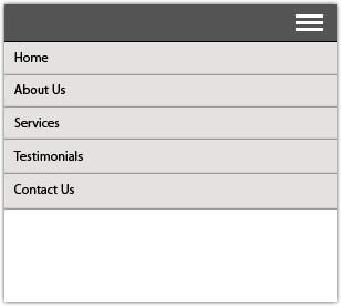 Since we’re not interested in displaying the mobile menu all the time, we’ll choose to hide it by default by setting the value for its display attribute to ‘none’. Here, for displaying the mobile menu(while hiding the primary menu) after having reached below a specified screen-size, we simply place the display statements within the related @media query. For instance, in case of TwentyThirteen, the value for screen size is 640px. It is recommended to check your current theme’s stylesheet to see as to which @media query would activate the small menu.
We’re done!
Since we’re not interested in displaying the mobile menu all the time, we’ll choose to hide it by default by setting the value for its display attribute to ‘none’. Here, for displaying the mobile menu(while hiding the primary menu) after having reached below a specified screen-size, we simply place the display statements within the related @media query. For instance, in case of TwentyThirteen, the value for screen size is 640px. It is recommended to check your current theme’s stylesheet to see as to which @media query would activate the small menu.
We’re done!