Grid frameworks are the basic building blocks of the website designs. Predefined gutter space and content width help web developers develop websites rapidly and efficiently. A right grid framework should allow developers to worry less about monitor screen sizes, resolutions and different browsers, but one must learn how to use it to achieve the desired result, once you master the art, using the grid system becomes flawless. Today we will look at some modern responsive and most lightweight CSS grid framework, which can be easily used in any website design projects.
This is a responsive grid framework. Larger images are automatically shrunk to the width of the column and it adapts to the width of the browser, works well with any smaller smart phones screens too. Developer claims to have tested it on MacBooks, an iMac, a PC laptop, an old PC, an Eee PC, an iPad, an iPhone 3G, an iPhone 4, a few Android phones, a Samsung Galaxy Tab, a BlackBerry and an older Nokia, so you can imagine how fluid it can get.
34Grid is a Responsive Grid System based on “equally distributed columns” layout basis. In contrast to other great grid systems, 34Grid provides equally distributed columns for each row. (and also column complements for inequal distributions)
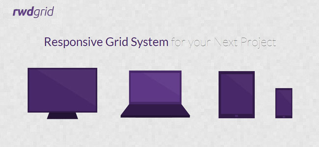
Rwdgrid is another Grid system based on popular 960grid, which is responsive and ranges from mobile, tablet, laptops and wide screen displays. Naming convention of this grid system is similar to 960 grid system, where underscore is replaced by hyphen (increases readabilty).rwdgrid is having different Grid system made for 1200px+ Displays, 960px+ Displays, 720px+ Displays and Mobile screens.
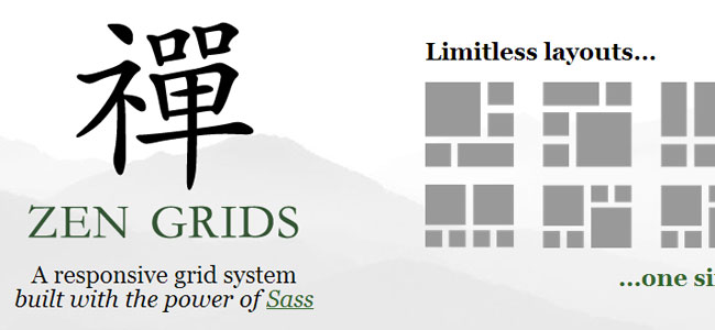
Create your next layout with a responsive grid system, built with the power of Sass. Sass adds author-friendly capabilities such as nesting, variables, arithmetic and mixins. And Sass gets compiled into regular CSS so its 100% compatible with all browsers.
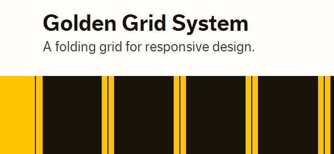
Golden Grid System (GGS) splits the screen into 18 even columns. The leftmost and rightmost columns are used as the outer margins of the grid, which leaves 16 columns for use in design. Now, 16 columns sounds a bit much for anything other than huge widescreen monitors. This is where the folding, inspired by the DIN paper system and Unigrid, comes in.
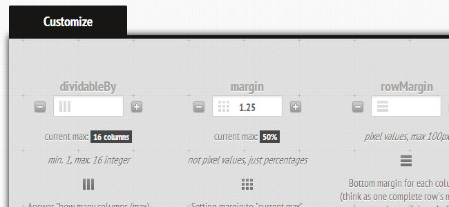
Set column and gutter widths, choose the number of columns, and switch between pixels and percentages. All without any .grid_x classes in your markup. Oh, and did we mention it’s responsive?
Simple CSS framework for fast, intuitive development of responsive websites. Built using the ‘Mobile First’ approach, ‘clearfix’ for clearing floats, box-sizing: border-box for adding additional padding to elements, and weighs less then 1kb compressed. Responsive design isn’t hard, you’ve just never used responsive.gs.
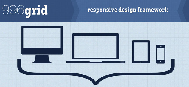
The 996 CSS grid system is a product of trying to find the best grid available for web design. It is an expansion of the original 960 grid combined with some media query magic and custom code. The grid also includes a css boilerplate to keep designs looking consistant across browsers.
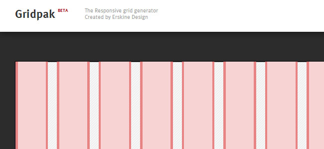
Gridpak is a Responsive Grid generator System. Gridpak is the starting point for your responsive projects, improving your workflow and saving time. Create your responsive grid system once using the simple interface and let Gridpak do the heavy lifting by generating PNGs, CSS and JavaScript.
Susy is Responsive grids for Compass, based on Natalie Downe’s CSS Systems, made possible by Sass, and made easy with Compass. You can use it anywhere, from static sites to Django, Rails, WordPress and more.
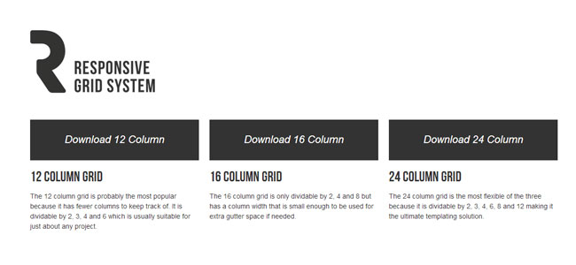
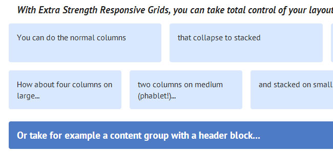
Set your site to max out at 960px, 640px, 320px or even stretch it out to full width. You can even space out your columns, create nested columns all the while making sure your images and videos remain fully responsive no matter what screen size.
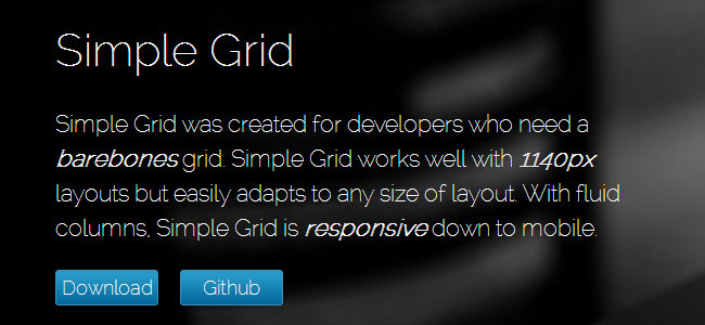
Simple Grid was created for developers who need a barebones grid. Simple Grid works well with 1140px layouts but easily adapts to any size of layout. With fluid columns, Simple Grid is responsive down to mobile.
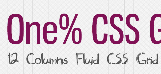
One% CSS Grid is a 12 column fluid CSS grid system. It’s been designed as a base for building responsive web layouts easily, quickly and with minimum effort. You don’t have to take care of resizing and rearanging your layout for each platform separatelly. One% CSS Grid will do all this for you.
Hi,
Recently I came across some great articles on your site. The other day, I was discussing (http://www.saaraan.com/2012/05/top-5-grid-system-for-website-development) with my colleagues and they suggested I submit an article of my own. Your site is just perfect for what I have written! Would it be ok to submit the article? It is free of charge, of course!
Let me know what you think
Contact me at [email protected]
Regards
Anele Ivanova


