Bootstrap Framework Quick Start
There’s been a lot of buzz lately about Twitter’s Bootstrap framework, many new excellent websites are built upon Bootstrap solid framework. whether your need is a responsive grid system or pre-styled typography, Bootstrap comes in handy, it is very easy to start and well documented. But if you are wondering where to start, look no further, because I am going to show you how responsive layout using Bootstrap works and how we can use it to create flexible websites, let’s get started.What is Bootstrap?
Bootstrap is a open source(free) front-end framework library for web developers, it was developed by Twitter’s Mark Otto and Jacob Thornton. Bootstrap comes with CSS stylesheets and jQuery plugins, which can be included in web projects for creating amazing websites and web applications rapidly. Since version 2.0 bootstrap supports responsive designs, this means web pages based on Bootstrap adjusts dynamically in tablet, desktop or smartphone.
Customize and Download Bootstrap
Bootstrap can be customized and downloaded here, just select components you need for your website, if you are unable to decide or confused, just select everything and hit download button, you can customize it later again when you are more familiar the framework. Extract the zipped file, and you should get following structure of folders and files.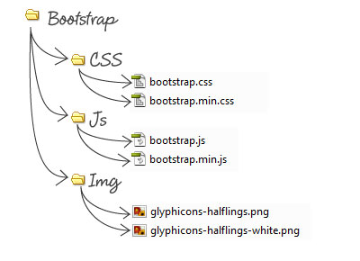 Good thing about customized download is that you want to include only things you need for your project and keep files smaller as you can. Once you download and extract you get both compiled and minified file variations. These two files: bootstrap.min.css & bootstrap.min.js with extension min.js and min.css are compressed files, if you open these files you’ll find no spaces and extra lines, its a strategy to save you few bytes and improve load time performances of your website. Since we only need minified versions bootstrap.min.css & bootstrap.min.js, we can delete other two non-minified files bootstrap.css & bootstrap.js at this point.
jQuery
Before we start, we also need latest jQuery from their download page, and include it inside Bootstrap JS folder. All bootstrap plugins are based on jQuery, so we must include jQuery before the bootstrap JS file so that things like bootstrap transition effects, dropdown, modal and popover effects run smoothly.Include Bootstrap into your project
123456789101112131415161718192021222324252627282930
<!DOCTYPE html>
<html lang="html">
    <head>
        <title>Bootstrap Magic</title>
        <!--
        Viewport meta tag below indicates that the site is Responsive & optimized for mobile.
        without this tag, your website may fail to adjusts dynamically in different devices,
        such as tablet, desktop or smartphone.
        -->
        <meta name="viewport" content="width=device-width, initial-scale=1.0">

        <!-- Include Bootstrap CSS -->
        <link href="css/bootstrap.min.css" rel="stylesheet" type="text/css" />
    </head>
    <body>
    <p>My responsive design.</p>
        <!--
         Site contents.
        -->

        <!--
        Include Jquery & bootstrap.min.js
        -->
        <script type="text/javascript" src="js/jquery.min.js"></script>
        <script type="text/javascript" src="js/bootstrap.min.js"></script>
        <!--
        Other Javascripts goes here
        -->
    </body>
</html>The Grid & Markup
Bootstrap default grid system comes with standard 12 columns, making for a 940px wide container. Below 767px viewports, all columns in the containers automatically become fluid and stack vertically. Fixed Container: Without making things anymore complicated, Lets see how easily we can achieve simple fixed 2 column layout with Bootstrap:HTML
123456
<div class="container">
  <div class="row">
        <div class="col-md-2"> Sidebar </div>
        <div class="col-md-10"> Main content </div>
  </div>
</div>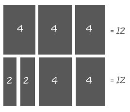 Here’s another example:
HTML
12345678910
<div class="container">
  <div class="row">
        <div class="col-md-2">Col 2</div>
        <div class="col-md-10">Col 10</div>
  </div>
  <div class="row">
        <div class="col-md-5">Col 5</div>
        <div class="col-md-7">Col 7</div>
  </div>
</div>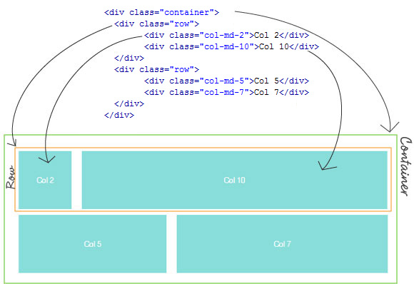 Here’s our code so far, I have added bit of own style here, just play with example code below, try adding up columns and rows, resize browser to different sizes or test it in various devices:
[cc lang=”html”]
Here’s our code so far, I have added bit of own style here, just play with example code below, try adding up columns and rows, resize browser to different sizes or test it in various devices:
[cc lang=”html”]
Col 2
Col 10
Col 5
Col 7
Adding Navigation
At this point you must be clear about Bootstrap responsive grid system, many grid frameworks out there work similar way, but Bootstrap is more advance and powerful, because it comes packed with many features such as buttons, modal box or the Navigation bar. Navigation is very important part of any websites, but many beautiful navigation menus don’t really work with responsive layout and would distort and fail! because they are not designed to adopt to the different screen sizes. Thanks to Bootstrap, we can have a responsive navigation bar, which will automatically collapse and adjust to different screen sizes.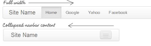 HTML Example below to achieve a Bootstrap collapsible navigation bar.
[cc lang=”html”]
HTML Example below to achieve a Bootstrap collapsible navigation bar.
[cc lang=”html”]