Making a Full Width Responsive Tiled Menu with CSS3 & jQuery
Full width responsive tiled menu is one of the most creative ways to display the navigation of your site. Not only it creates a very full-bodied effect for visitors but also gives them a taste of trendy flat design. In this tutorial, I’m going to create a full width tiled menu and make it fully responsive using CSS3 Media Queries. At the end, I’ll also use some quick JavaScript to show or hide the tiled menu on smaller screen devices. Let’s get started!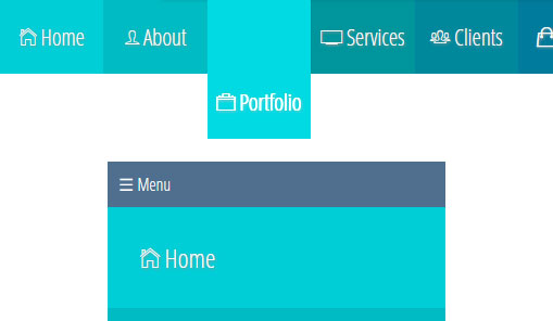
Include Files
This is the first step toward creating a tiled menu. All you have to do is to put all necessary files between the and tags of your HTML page. This may consist of links to your favorite Google Fonts, CSS, jQuery and icon font that you want to use.HTML
12345
<head>
  <link href='http://fonts.googleapis.com/css?family=Open+Sans+Condensed:300' rel='stylesheet' type='text/css'>
  <link href="http://code.ionicframework.com/ionicons/1.5.2/css/ionicons.min.css" rel="stylesheet">
  <script src="//code.jquery.com/jquery-2.1.0.min.js" type="text/javascript"></script>
</head>Structure the Menu
Once you’ve put all necessary files in the of your HTML document, the next thing you need to do is developing the menu. Check out the markup for the menu below:HTML
1234567891011121314151617
<body>
<nav class="nav-bar">
<div class="nav-container">
<a id="nav-menu" class="nav-menu">☰ Menu</a>
<ul class="nav-list " id="nav">
<li> <a href="#" id="tile1"><i class="icon ion-ios7-home-outline"></i> Home</a></li>
<li> <a href="#" id="tile2"><i class="icon ion-ios7-person-outline"></i> About</a></li>
<li> <a href="#" id="tile3"><i class="icon ion-ios7-briefcase-outline"></i> Portfolio</a></li>
<li> <a href="#" id="tile4"><i class="ion-ios7-monitor-outline"></i> Services</a></li>
<li> <a href="#" id="tile5"><i class="ion-ios7-people-outline"></i> Clients</a></li>
<li> <a href="#" id="tile6"><i class="ion-bag"></i> Order</a></li>
<li> <a href="#" id="tile7"><i class="ion-ios7-paper-outline"></i> Blog</a></li>
<li> <a href="#" id="tile8"><i class="ion-ios7-email-outline"></i> Contact</a></li>
</ul>
</div>
</nav>
</body>Style Elements
Once the menu is created, now it’s time to dig into the CSS. Let’s start with adding styles to the body, .nav-bar and .nav-container classes.CSS
1234567891011
body{
    font-family: 'Open Sans Condensed', sans-serif;
    background: white;
}
.nav-bar {
    width: 100%;
}
.nav-container {
    overflow: hidden;
    margin: 2.95% auto;
}CSS
1234567891011121314151617181920212223242526272829303132
.nav-menu {
  display: none;
}
nav.nav-bar ul {
  list-style: none;
}
.nav-list {
  margin: 0 auto;
  width: 100%;
  padding: 0;
}
.nav-list li {
  float: left;
  width:12.5%;
}
.nav-list li a {
  display: block;
  color: #f9f9f9;
  text-shadow: 1px 1px 3px rgba(150, 150, 150, 1);
  padding: 30px 30px;
  font-size: 1.5em;
  text-align: center;
  text-decoration: none;
  -webkit-transition:all 0.2s linear;
   -moz-transition:all 0.2s linear;
     -o-transition:all 0.2s linear;
        transition:all 0.2s linear;
}
.nav-list li a:hover {
  -webkit-filter: brightness(1.3);
  padding-top: 80px ;
}CSS
123456789101112131415161718192021222324
#tile1 {
  background:#00ced7
}
#tile2 {
  background:#00bbc3
}
#tile3 {
  background:#00a8af
}
#tile4 {
  background:#00959c
}
#tile5 {
  background:#00889c
}
#tile6 {
  background:#007b9c
}
#tile7 {
  background:#006e9c
}
#tile8 {
  background:#005c83
}
Add Media Queries
To incorporate responsiveness in our created tiled menu, we have to use CSS media queries. Because different devices support different media queries, you need to target a device according to the screen resolution it has. For example, I’ve used the following CSS for the first breakpoint at 480px.CSS
1234567891011121314151617181920212223242526272829
@media screen and (max-width: 480px) {
.nav-container, .container {
    background:#4f6f8f
}
.nav-menu{
    color: #fff;
    float: left;
    display: block;
    padding: 10px 10px;
    cursor: pointer;
}
.nav-list{
    float: left;
    width: 100%;
    height: 0;
}
.nav-open {
    height:auto
}
.nav-list li {
    width:100%
}
.nav-list li a {
    text-align: left;
}
.nav-list li a:hover {
    padding-left: 36%;
    padding-top: 30px;
}CSS
12345678910111213
@media screen and (min-width: 481px) and (max-width: 768px) {
  .nav-container,.container {
    margin: 8% auto;
  }
  .nav-list li {
    float: left;
    width: 50%;
  }
  .nav-list li a:hover{
    padding-right: 40%;
    padding-top: 30px ;
  }
}Implement JavaScript
After making our tiled menu responsive, now it’s time to implement some basic JavaScript to make the navigation toggle function on smaller screens. Below is the JavaScript that I’ve used in my demo code:JQUERY
12345
$(document).ready(function(){
	$('#nav-menu').click(function(){
		$('ul.nav-list').addClass('open').slideToggle('200');
	});
});